Alphalytics
Alphalytics aggregates disparate data streams into one application; then utilizes advanced predictive analytics to reveal root denial causes.
TEAM
Senior UX Designer
Engineering Leads
Customer Success Leader
DELIVERABLES
Wireframes
Prototypes
HIFI Designs
DURATION
12 months
CONTRIBUTIONS
UI/UX Design
Research and Testing
OVERVIEW
The problem of denied claims in hospital systems poses a significant challenge for claims denials teams. These teams are tasked with reviewing and resolving claims that have been rejected by insurance providers or payers. Denied claims can result from various reasons, including coding errors, insufficient documentation, or lack of medical necessity. As a result, hospitals face financial setbacks and patients may experience delayed or denied coverage for essential medical services.
Easy access and the ability to explore their claims related data are therefore critical for a claims denials team to understand, reveal and track root denial causes.
My role, on this project, was to redesign the existing filtering experience to make it more intuitive to use and reduce cognitive load. This would allow existing and new customers to more easily explore and identify root denial causes leading to actionable insights and recovered revenue.
OPERATIONAL CHALLENGES
Application is still using an outdated version of Bootstrap v3.4, no engineering resources or time to update to the latest version
Unable to leverage our Material UI design system and MUI react components for implementation
Split across multiple projects and working mostly in a consulting capacity
No dedicated product owner in this space
UNDERSTAND
I began the design process by performing a heuristic evaluation of the current filtering experience. This helped me understand the existing CRUD flows for filtering and identify areas for improvement. I also leveraged feedback I received from the product owners and users that were currently using the application. Unfortunately, we were unable to perform any usability testing at this stage due to resourcing.
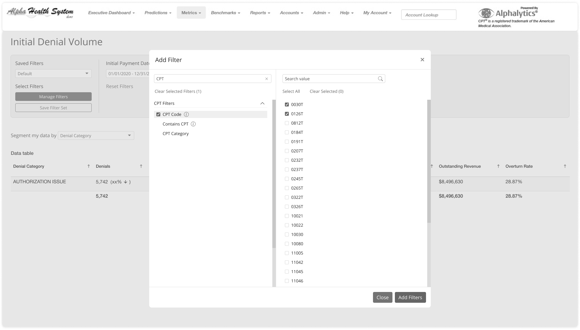
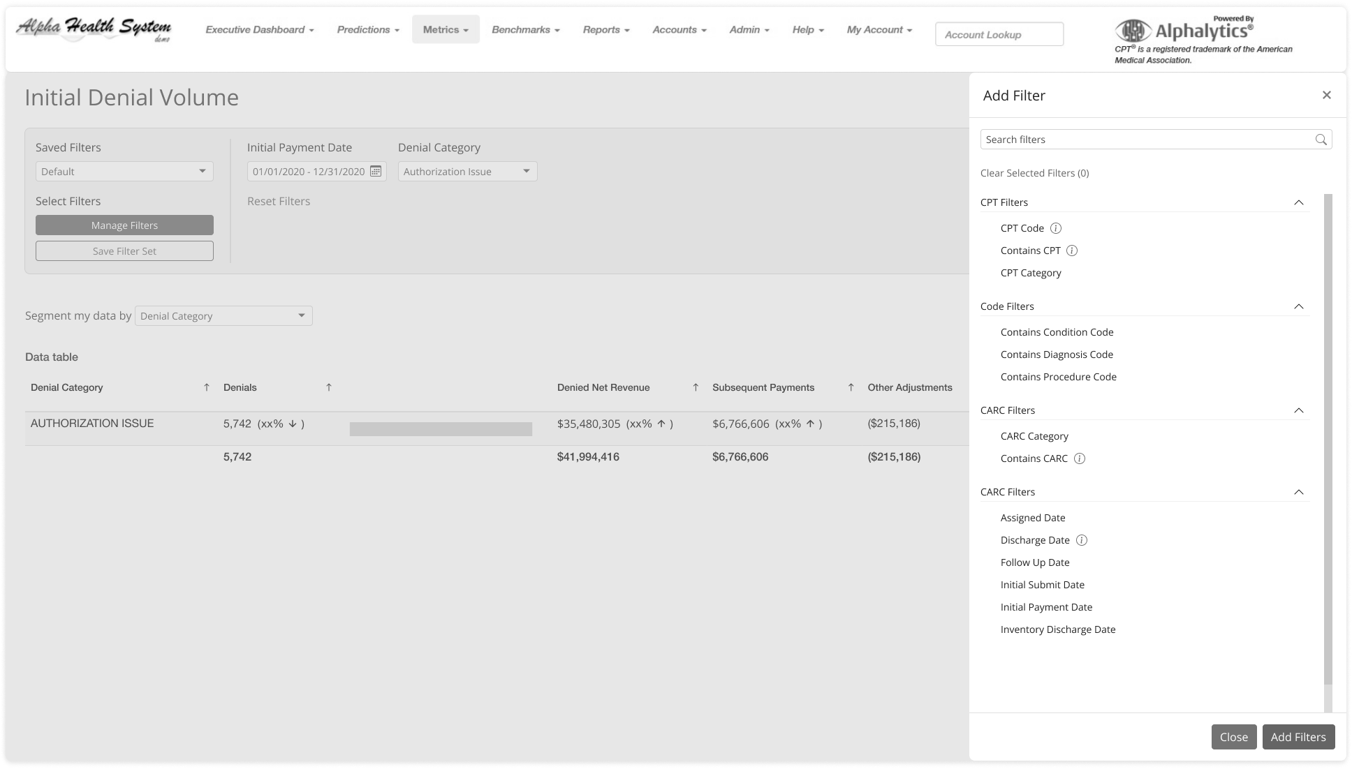
FILTER EXAMPLES
DRILL DOWN FILTERING
SAVED FILTERS VS PROFILES
KEY TAKEAWAYS
Number of filtering options can be overwhelming and increases cognitive load
Filter in its expanded state takes up too much vertical space
Difficult to quickly see which filters are active and their applied values
Confusing visual hierarchy between filter details, filter options and filter actions
Requires training for a user to proficiently use, some filter definitions are unclear
Saved filters and profiles have overlapping functionality
PERSONAS
Leveraging existing research documentation, I was able to identify the two key user personas:
Denials Analyst | Generalist

Denials Analyst | Specialist

DESIGN GOALS
Leverage existing and familiar mental models to make the filtering experience more intuitive
Simplify the filtering experience by separating applied filters from filter selection
e.g. filter selection as a modal or panel
Create a more explicit visual hierarchy between filter details, filter options and filter actions
Combine profiles and saved filters into a single concept to reduce redundancy
Provide greater context when selecting previously created saved filters
Reduce the vertical space of the expanded filter area
DISCOVERY
How do other tools approach filtering?
KEY TAKEAWAYS
Filtering follows common patterns like side panels, modals or anchored near the header.
Applied filters displayed as interactive pills
Drill down filtering is reflected in the filter area in real-time
Clear visual hierarchy for filter actions
WIREFRAMES
Keeping my design goals in mind, my next step was wireframing key filtering flows
FILTER COMPONENT OPTIONS
Side Panel
Pros
+ More flexible with larger amount of filter and filter value options
Cons
- Modal appears as an overlay
FILTER PATTERN OPTIONS
1. Filter Card | Expanded

2. Filter Bar

Modal
Pros
+ More contextual filtering
+ Multiple filters can be
Cons
- Too compact for some use cases
Filter Card | Collapsed

3. Filter as Datasets (Filter Sets) Tab

PROTOTYPE & TESTING
Focusing on creating and modifying filter set flows, I created interactive prototypes to conduct usability testing with the research team.
30 min moderated sessions on Lookback.io with 6 participants. One Alphalytics user and five non Alphalytics Users
TESTING GOALS
Understand if filter set creation is intuitive to users and meets their expectations
Loading filter sets
Creating filter sets
Editing filter sets
Do users understand how to apply new filters?
SCENARIOS:
Scenario 1: User can easily locate and pull up a previously saved filter set
Scenario 2: User can successfully create and save a new filter set
Scenario 3: User can easily locate and modify a previously saved filter set
Research Planning and Findings
KEY INSIGHTS
All participants struggled to locate the loading feature at first. They did not see it as an action button but thought it was part of the TABs.
Explore alternatives for loading action or alternative copy, something closer to creating a new browser tab
Some participants expressed confusion regarding the location of the “Create” and “Load” buttons. Participants expected to see the actions closer together.
Move the create and explore options together to improve discovery
Most participants were confused about the terminology used for “Filters Sets” and “Filters.” They did not grasp the difference between both terms and their related actions.
Simplify terminology to just “filters”
When loading a new filter set, participants expressed confusion around the meaning favorited and all “Filter Sets;” specifically where these filters were originating from
Add explainer text to help users understand the difference between favorited filter sets and all filter sets.
HIFI DESIGNS
Taking into consideration feedback from usability testing, high-fidelity designs were created for handoff to engineering.
BEFORE| Filtering
HIFI | Filtering
HIFI| Filtering Components
OUTCOMES & LEARNINGS
As a result of this project, I delivered a more intuitive filtering experience for existing and new customers, empowering them to more easily discover, track and take action on root cause denials; leading to increased overturned claims and reclaimed revenue.
Updated filtering for Alphalytics launched in June 2021 and formed the basis for filtering patterns in other Advata products.
METRICS
17% increase in the number of saved filters being created by users
LEARNINGS
There are many existing patterns and mental models for filtering that can be leveraged
A deeper understanding of the challenges faced in healthcare revenue cycle management
Treating saved filters as tabs opens the door for more advanced tracking and monitoring